This is something I've been planning to do for ages, but the stars have only just aligned to make it possible (ie: I now have access to my own scanner). I've seen this done on a few artists blogs elsewhere and I always find it interesting, so who knows - someone reading this might. Maybe. No? Well whatever, I'm doing it anyway.
(NB: Rather than an actual page of narrative art, the piece below is actually a small part of the final cover for the collection of #1 - #3 I'm putting together but the process for anything I do is the same.)
For any thing I'm gonna draw, first up is a thumbnail sketch. Sometimes I might do several concepts, sometimes only one. However many I do, the actual time I spend just 'mulling it over' is almost as important. Although I've not been drawing either comics or The Absence for long, I have a background in art eduction and and I'm a graphic designer by trade so I'm used to thinking visually (usually while staring at the bedroom ceiling unable to sleep...) and I can usually sort out most composition problems in my head before committing them to paper. The thumbnails are usually just to clarify things.
Here's the scrappy bastard I did for this piece:
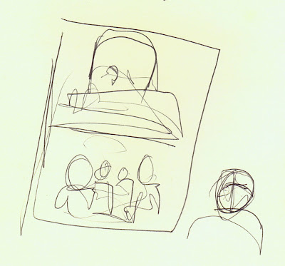
Pretty rough, eh? That's the whole cover - the bit we're looking at here is the bottom half. I actually did another rough on my mac using a Wacom tablet (man, I HATE drawing on that damn thing) and I totally failed to save it. But it didn't matter - the act of simply sketching it out helped to concrete the image in my head.
Anyway, after that is the first pass on art paper. I use a very thick water colour stock because I love the rough surface. It catches ink really nicely and I adore the occasional splashes and scratches you get when your brush or pen nib catches in it. Here's the first pencil rough:
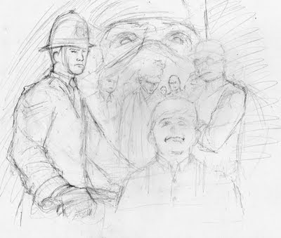
As you can see, it's pretty loose. This stage is basically to establish the composition so I keep it light and loose, usually with a 2H pencil (I've cranked up the levels on this scan so you can see it). If I happen to get too detailed that's all fine but my next stage is basically to rub the entire thing out with a putty rubber until it's all barely visible to the naked eye. Then the real work begins: I draw it all again, spending more time getting the details in. I use the light lines as a guide.
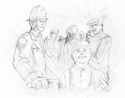
It's this stage which, one day, I hope to be able to skip. One of
my favourite artists, Sean Philips, goes straight from the early roughs to inking and I totally admire his confidence (although, to be fair, he has several years experience on me). If I'm not careful tend to over-labour this stage. I like my art loose and casual (like my wome-- wait, what?) and by over-labouring my pencils I can sometimes find that tightness creeping into the final work.
Anyway, once I'm happy with the pencils, I grab my trusty dip pen and do some inking up of the lines:
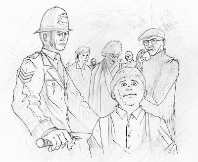
I do this bit fast. Really fast. I'm not looking for tight, careful lines – I want the lines which jump and flick and wander across the page. During this stage I'll also be making lots of decisions about how the final art will look. Sometimes I'll even re-edit the composition (notice the big eyes in the background haven't been inked - that's because I decided to do those as a separate piece and composite altogether in Photoshop. It's also here that I usually have my first fuck up. Check out the policeman's left eye. WTF? It's totally screwed - it's wandering up way too high and it looks like he's deformed or something. Shit.
Now I grab my brush and basically fill in the blacks. Here's a 'work in progress' pic of that.
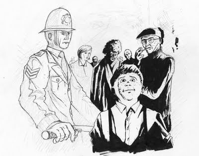
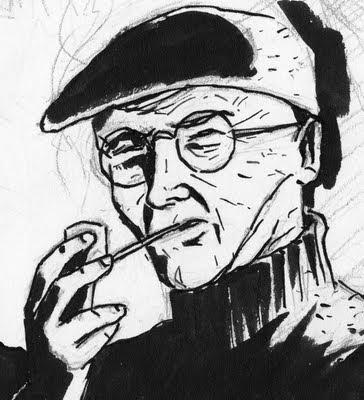
I use a normal (and somewhat knackered) brush with black W&N indian ink. This christmas just gone I got a Pental brush pen which I've totally fallen in love with so I've been using that lots too, but I find it holds too much ink and I struggle to get the nice dry brush marks I can achieve with a regular brush. Here's a detail of the above pic which hopefully illustrates this.
I just continue painting away till I'm happy I've done as much as I can. If I have large areas of black to cover I'll leave 'em empty and do them on the mac. No point in using up all my ink, eh? Once all the areas are filled, a bit of splatter to liven it up, a bit of some white ink to pick out highlights etc and then I rub out the pencil work as best I can and then I'm left with the 'final' art to scan in.
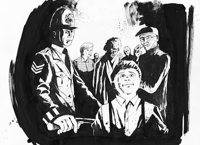
Once the pic is on the mac I go Photoshop happy. I fix stuff I'm not happy with (like the police man's wonky eye – I even moved his hat down a bit), fiddle with the levels to get rid of the pencil (but preserve the dry brush - bit tricky this bit. I often have to use several different layers of levels with different settings on each). I'll fill in any blacks I left empty at the painting stage and add any effects I need. If it this was an actual strip page I'd also clean up the edges and panel borders in Photoshop too.
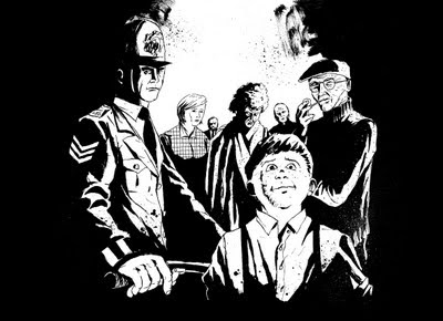
As I mentioned previously this is part of the cover, so it's also going to need some colouring.
I've already revealed part of the fully painted cover in an earlier post (although this too has since been Photoshopped to hell and back). I fiddled for ages with the colouring on this group shot – even going as far as to try a fairly 'traditional' comic book approach but it always looked crappy and half-hearted. I just don't have the patience to colour stuff properly I guess.
So, as usual, I used my tried and tested method of chucking various textures and colours around until I got something I could at least live with. Hence this:
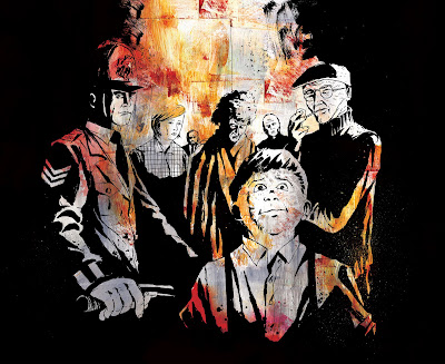
The weird thing about working on a Mac - which is a pretty sterile working environment with all manner of 'undo's' – is that you can still be prone to my favourite part of the hand-crafting process: 'the happy accident' (nb: this entirely unrelated to '
the happy ending'). The fact they all look like they're kind of standing in front of a fire? Happy accident. But, sshh. No spoilers.
And that's yer lot. There's still a way to go on this image – since it's only part of the cover it'll need putting in with the rest of the images and logo and other odds and sods, but this, in essence, is my general working process. You might notice I've taken the policeman down in size a bit on the final version here. That's because I had trouble fitting it in with the other elements on the cover.
Still not happy with that fucking eye, though...


